✳STUDIO CONCEPT / 03
TERRA
Grounded in the everyday.
A tactile packaging direction inspired by botanical forms and quiet rituals.
- Industry
- Personal care
- Creative focus
- Packaging
- Study year
- 2026
- Project type
- Independent concept
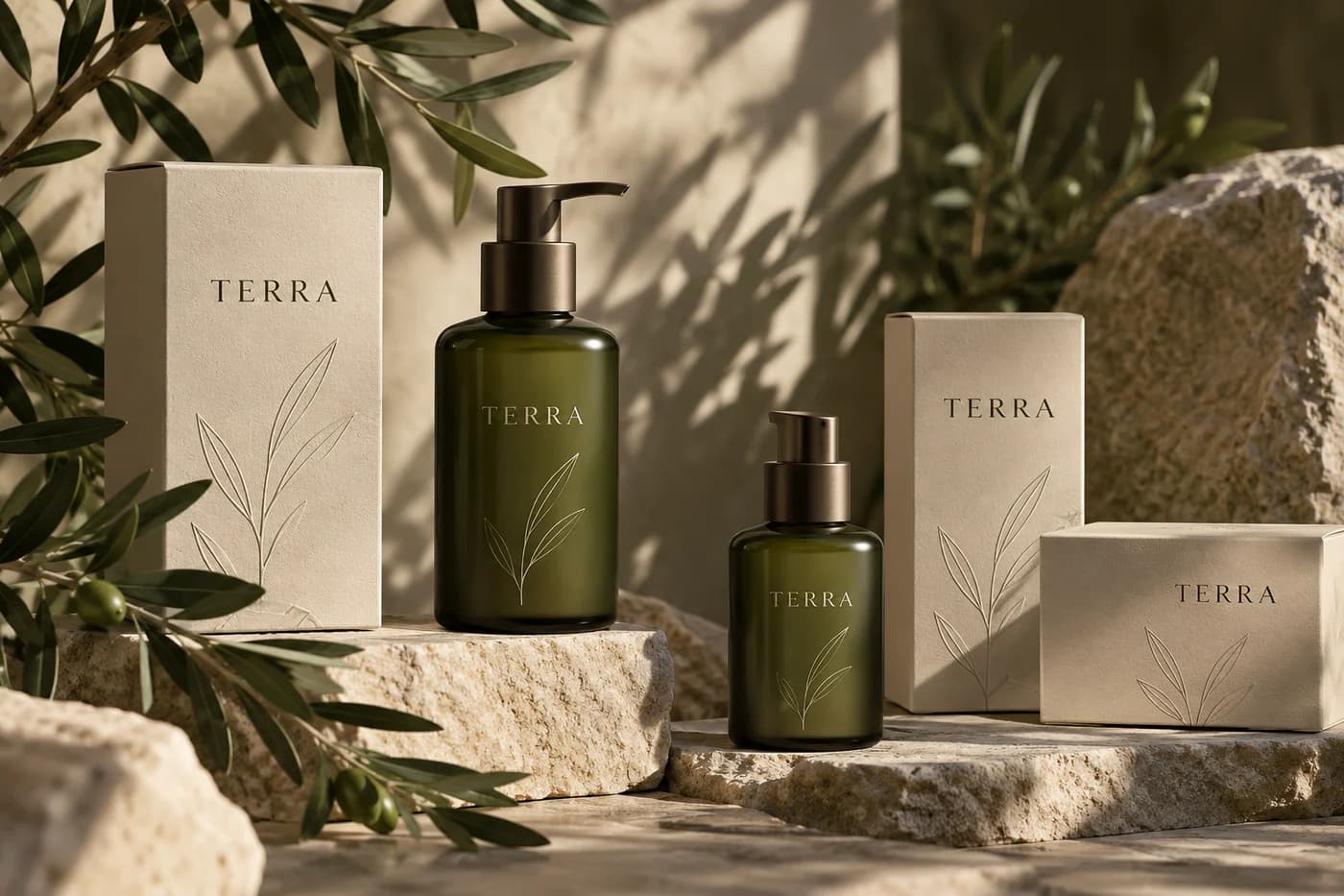
STUDIO CONCEPT A fictional brand and independent design study. Mockups are illustrative AI-generated visuals, not commissioned client work.
✳01 / THE BRIEF
A different starting point.
This fictional care label needed a visual language that felt natural and considered, without relying on decorative leaves everywhere or making unsupported ingredient promises. The study centres on packaging clarity and the feeling of a small daily ritual.
✳02 / THE APPROACH
A clear creative direction.
Olive glass, oatmeal paper and grounded typography form the core of the direction. A restrained botanical line gives the system an organic counterpoint, while a consistent label grid creates space for product information.
✳03 / THE VISUAL LANGUAGE
The details make the difference.
The identity is built around contrast: smooth glass beside textured paper, flowing linework beside stable type, muted green beside warm cream. The palette keeps the objects visually grounded while the label grid gives each format a consistent point of reference.
Grounded in the everyday.
Montserrat Regular
Grounded serif forms with a clear modern supporting voice.
Olive leaf
#626C4COat paper
#ECE5D5Forest ink
#26382BSoft stone
#C9BDABA focused palette gives the concept a recognisable character, with room for contrast, hierarchy and quieter supporting moments.
✳04 / MAKING IT WORK
One idea. Different expressions.
The direction is explored across complementary formats, with each application doing a different job.
A family of products
The repeated label grid and colour logic suggest how an imagined range could remain coherent as it grows.
A quieter shelf
Uncluttered front panels make the central identity the focal point while leaving room for essential product details.
Material-led imagery
Botanical shadows and natural stone support the mood without turning the packaging into a literal landscape.
✳THE EXPLORATION
What came together.
- Wordmark direction
- Bottle label system
- Carton concept
- Botanical motif
- Product art direction
Have a different world in mind?
Let’s find a creative direction that feels right for your business.
Tell us about your idea