
✳STUDIO CONCEPT / 08
AURA
Details worth keeping.
A refined identity and packaging study for a fictional jewellery collection.
- Industry
- Jewellery & accessories
- Creative focus
- Packaging
- Study year
- 2026
- Project type
- Independent concept
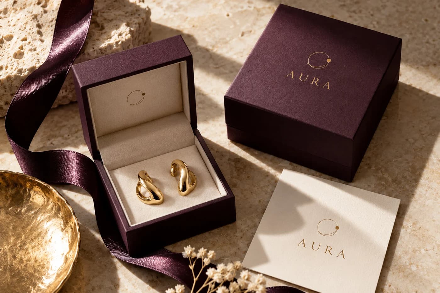
STUDIO CONCEPT A fictional brand and independent design study. Mockups are illustrative AI-generated visuals, not commissioned client work.
✳01 / THE BRIEF
A different starting point.
Small objects often carry the most personal meaning. This concept explores how a jewellery label could communicate care and character through restrained packaging, while allowing the pieces themselves to remain the focus.
✳02 / THE APPROACH
A clear creative direction.
A deep aubergine palette, warm ivory paper and a delicate orbital motif establish the direction. The wordmark uses elegant serif forms, balanced by clean supporting type for care information and everyday communication.
✳03 / THE VISUAL LANGUAGE
The details make the difference.
The study is about proportion and material contrast: a small foil detail against matte paper, a fine line beside a substantial box, a soft ribbon around a crisp edge. These contrasts create a clear hierarchy, letting the jewellery remain the focal point while the surrounding elements provide a quiet frame.
Details worth keeping.
Montserrat Regular
Elegant proportions and fine details, with an understated supporting voice.
Aubergine
#513246Champagne
#C5A77DIvory
#F5EFE2Soft mauve
#BDA7AEA focused palette gives the concept a recognisable character, with room for contrast, hierarchy and quieter supporting moments.
✳04 / MAKING IT WORK
One idea. Different expressions.
The direction is explored across complementary formats, with each application doing a different job.
A quiet reveal
The box uses a restrained central mark, with material texture and a small metallic accent providing the detail.
Care beyond the box
A simple care-card layout gives supporting information the same clarity as the main identity.
A complete impression
Ribbon, card and packaging share a limited palette so each touchpoint feels part of the same considered family.
✳THE EXPLORATION
What came together.
- Wordmark study
- Orbital emblem
- Jewellery-box direction
- Care-card layout
- Packaging art direction
Have a different world in mind?
Let’s find a creative direction that feels right for your business.
Tell us about your idea