
✳STUDIO CONCEPT / 01
OFFBEAT
Good coffee. Your own rhythm.
A coffee identity with a bright personality and a rhythm of its own.
- Industry
- Specialty coffee
- Creative focus
- Branding
- Study year
- 2026
- Project type
- Independent concept
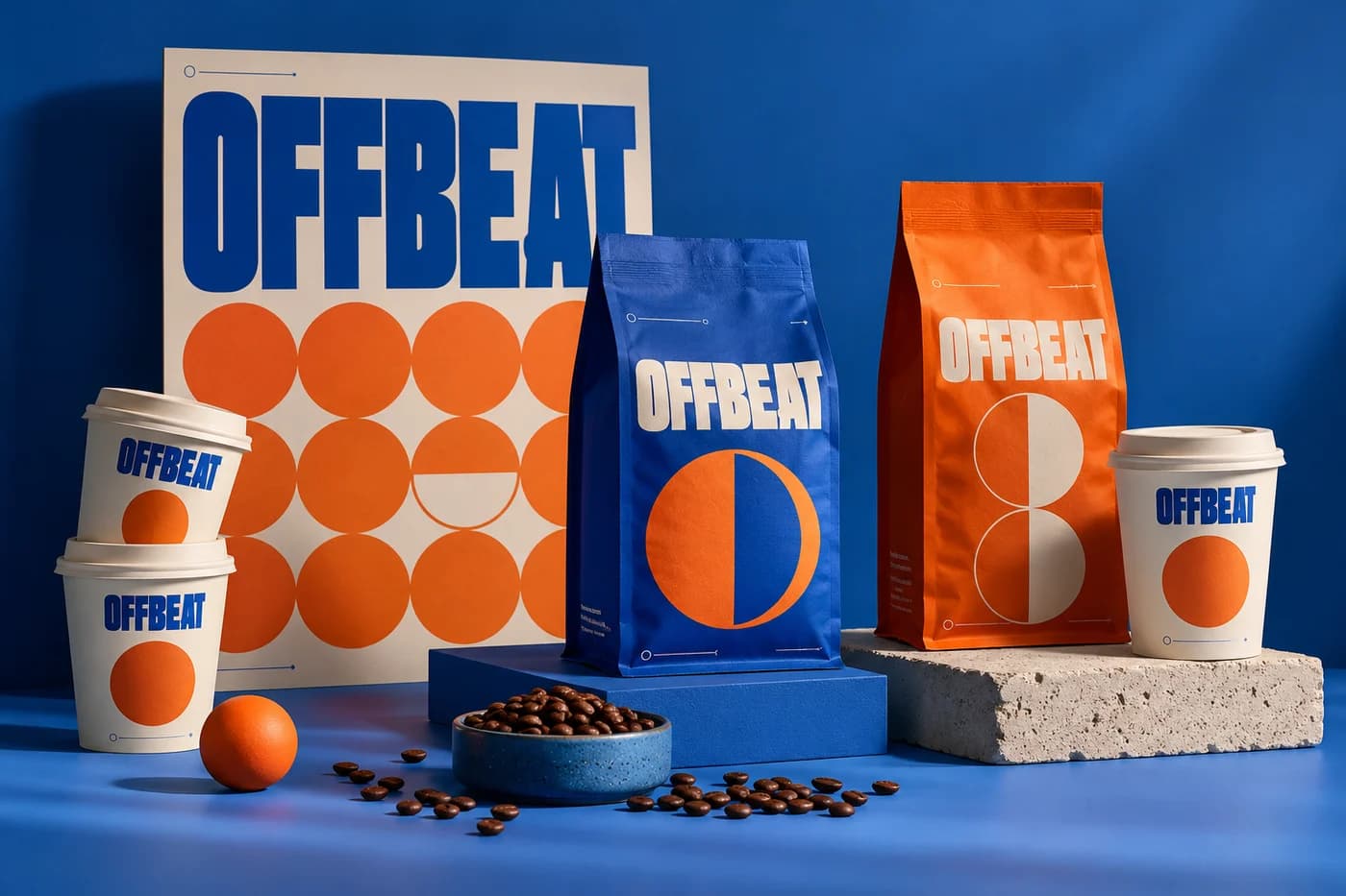
STUDIO CONCEPT A fictional brand and independent design study. Mockups are illustrative AI-generated visuals, not commissioned client work.
✳01 / THE BRIEF
A different starting point.
Imagine a neighbourhood coffee label that feels welcoming without disappearing into the familiar world of brown bags and rustic lettering. The brief for this study was to make everyday coffee feel more expressive, while keeping the range easy to navigate.
✳02 / THE APPROACH
A clear creative direction.
We paired a confident wordmark with an unexpected cobalt-and-orange palette. Repeating circles suggest coffee stains, records and daily rituals. A simple hierarchy gives the brand room to be playful around the edges while keeping the important information clear.
✳03 / THE VISUAL LANGUAGE
The details make the difference.
The visual rhythm comes from repetition with small surprises: a circle moves, a colour reverses, a headline changes scale. The result is a flexible direction that can travel from a coffee bag to a cup, a shop window or a social post without losing its character.
Good coffee. Your own rhythm.
Montserrat Regular
Bold, rhythmic and easy to recognise.
Electric cobalt
#244BC6Tangerine
#EC6A34Milk paper
#FFF4DCEspresso
#24201DA focused palette gives the concept a recognisable character, with room for contrast, hierarchy and quieter supporting moments.
✳04 / MAKING IT WORK
One idea. Different expressions.
The direction is explored across complementary formats, with each application doing a different job.
On the shelf
Colour blocking and a clear central wordmark create a recognisable family of bags, with space reserved for blend details.
In your hand
The cup uses a simplified graphic treatment so the identity remains readable at a smaller, more everyday scale.
Out in the world
Oversized type and repeatable circle motifs give posters and launch creatives a consistent starting point.
✳THE EXPLORATION
What came together.
- Wordmark study
- Colour system
- Coffee bag concept
- Takeaway cup direction
- Launch graphics
Have a different world in mind?
Let’s find a creative direction that feels right for your business.
Tell us about your idea